
Common factors driving the US labour market
During the annual economic policy symposium in Jackson Hole, Fed chair Janet Yellen discussed the indicators that the Fed closely monitors in order to analyse US labour market developments. She also mentioned the use of factor analysis to understand the common drivers of the various indicators.
We used a similar model to assess the underlying common factors driving labour market dynamics. Out of the 19 data series the Fed listed, we focused on 13 dating back to 1986* and used the necessary stationary series transformations (assessed to be significant at the 10% level), in order to run a principal component analysis (PCA) on the underlying data set.
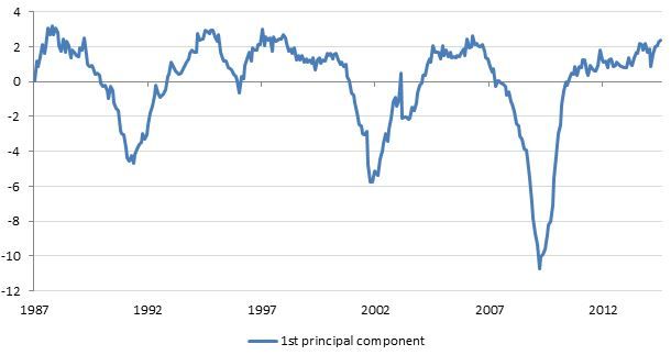
Chart 1 below shows the first principal component of the data series set, which explains approximately 53% of the common moves in the various data series studied. In terms of the relationship with individual indicators, we found that the unemployment rate has a negative loading on the first principal component, implying that an increase in the principal component is consistent with an improvement in the labour market and vice versa.
Chart 1: First principal component of the US labour market indicators
US – Curve flattening. What are the fundamentals saying?
In order to derive implications for the shape of the yield curve, we ran a regression of the slope (defined as US 10yr yield – US 2yr yield) on the three principal components. We found that, in general, improvement in the labour market was consistent with a flattening of the curve as indicated by the negative sign of the beta coefficients (which were all significant at the 5% level and the adjusted R square was around 64%).
However, analysis of the residuals (actual – fitted) provides us with interesting insights (see chart 2 below). Currently, we find that the difference between the actual slope of the yield curve and the model fit is more than one standard deviation (sd) away from the historical mean. Put another way, the actual slope of the yield curve appears to be more than one standard deviation steeper than the model implies. We also find that the “catch-up” appears to have started with the flattening of the curve we have seen so far this year but the actual slope remains significantly above its model-driven fair value.
Chart 2: Modelling the shape of the curve as a function of US labour market dynamics
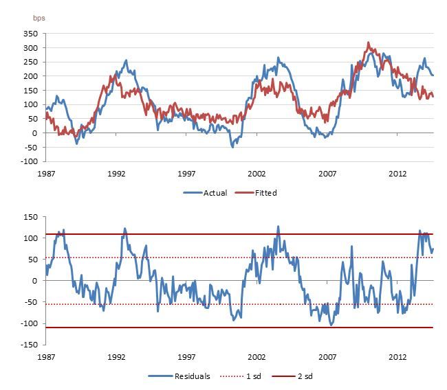
Overall, the modelling exercise provides two important insights. First, the PCA analysis suggests significant improvement in the labour market situation. Second, linking it to the shape of the curve shows fundamental backing for the flattening theme. Indeed, curve flatteners have been an important trading theme in our portfolios and this analysis strengthens this conviction.
Authors:
Philipp Burckhardt and Salman Ahmed,
Lombard Odier Investment Managers
Dr. Stephen Satchell,
Fellow, University of Cambrige
*Unemployment rate, labour force participation rate, part-time for economic reasons, private payroll unemployment, government payroll unemployment, average weekly hours, average weekly hours of persons at work, average hourly earnings, insured unemployment rate, job losers unemployed less than five weeks, jobs plentiful versus hard to get, hiring plans and jobs hard to fill.
